American Family Dashboard

Serving 14 million policies. Optimized to convert, built to reduce call-ins

Role

UX Designer

Industry

Insurance/Financial

Duration

10 weeks

a cell phone on a table

UX Designer – Responsive Web, Native iOS & Android

Challenge + Approach

American Family’s customer dashboard handled 14 million policies—but it was hard to use.
Key billing info was buried, navigation was clunky, and customers struggled to understand which policy or billing account they were looking at.
Worse, the UI pushed essential info below the fold, making it easy to miss what mattered.

“The UX team wasn't allowed to speak directly to customers due to liability—but I still found ways to get insight. I interviewed support reps, listened to call recordings, and talked to employees who were also policyholders.”

Despite strict corporate guidelines that limited too many visual changes, I restructured the content hierarchy and interaction flow to create a more intuitive, efficient experience.

a cell phone on a white block
two cell phones on a gray surface

How it all came together


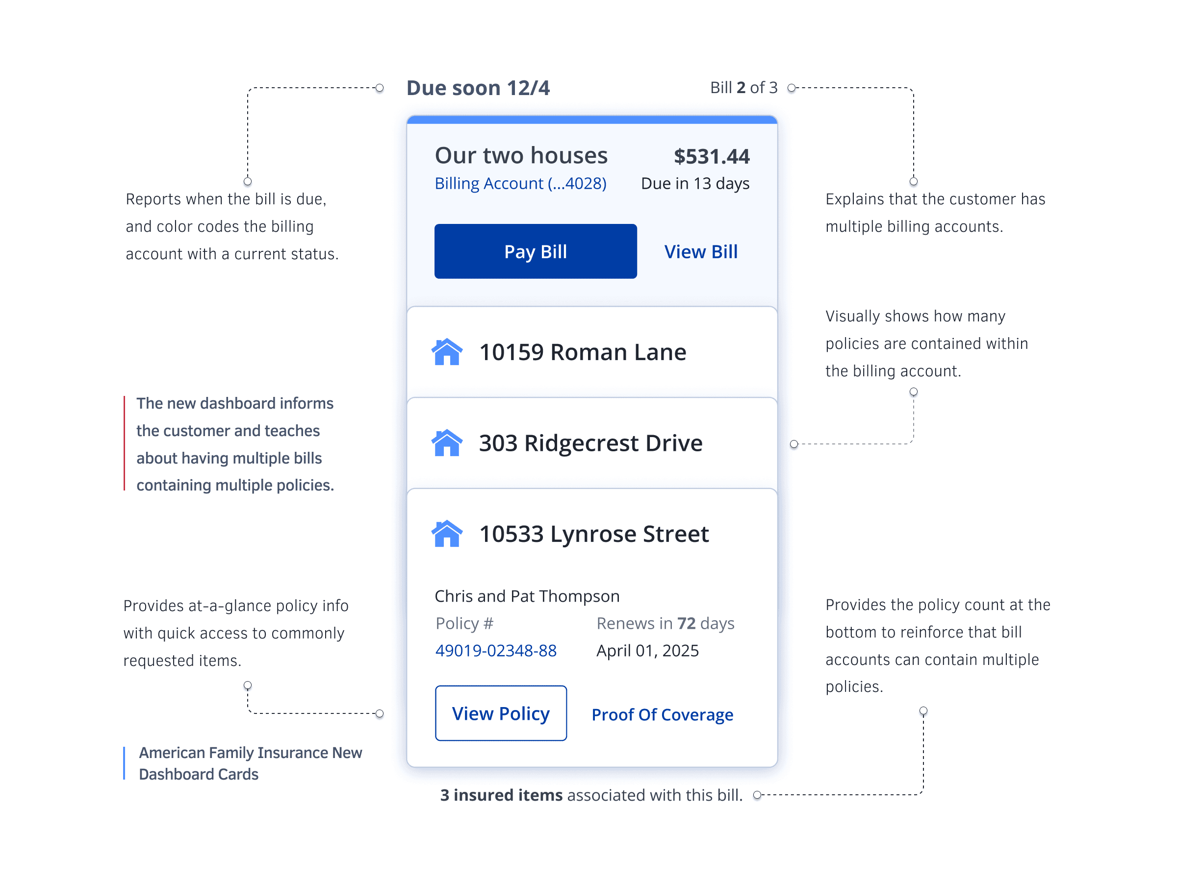
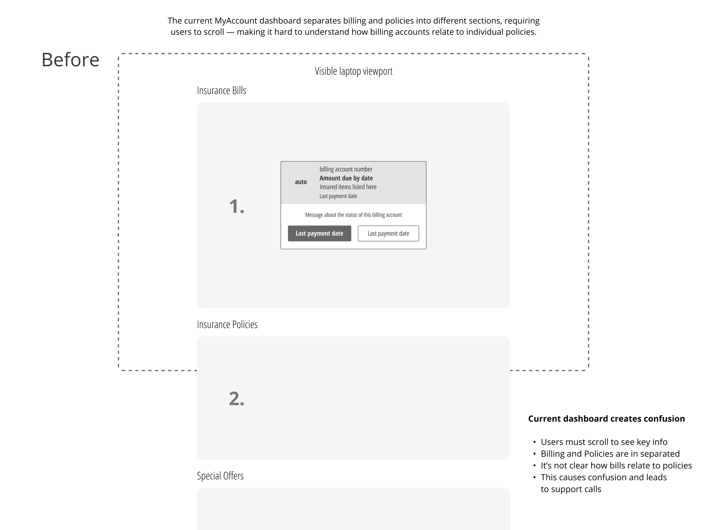
Leading UX on the Billing & Payments product team, I wasn’t just cleaning up a UI—I was helping solve a business-critical problem:
We needed people to pay faster, more consistently, and most importantly—without calling in.

But users were getting hung up at the front door. The dashboard made them question which policies they were paying for—and why. A lot of them called instead.

The dashboard fix gave customers better footing. But once inside, they were still getting lost.

That’s where the bill payment flow came in. I made two small changes that made a massive difference:

  1. Consolidating multiple fragmented forms and design patterns into one clear place to choose what, how, and when to pay.

  2. Adding an Edit Payment CTA that worked like an “edit cart” button—giving users a familiar, repeatable way to review and adjust their payments without starting over.

I built an early prototype in Figma to test and validate the updated bill payment flow across responsive web, Android, and iOS.

a cell phone leaning on a ledge
a pair of cell phones on a concrete block
a cell phone with a yellow rectangular screen

Outcome + Why It Matters

Together, improving the dashboard + fixing the bill pay flow cut confusion, rebuilt trust, and led to a 40% improvement in online payment completion.
It turned a bloated experience into something familiar, fast, and far more forgiving.

Additional Outcomes

  • Fewer support center calls

  • Fewer abandoned payments

  • Payments collected earlier in the cycle

  • Higher confidence across platforms

  • A more familiar, shopping-like flow


This dashboard didn’t just look better—it guided customers through the information like a helpful friend.

Check this out

© Bryan Dorsey 2025

© Bryan Dorsey 2025

© Bryan Dorsey 2025