The Micro-Dashboard That Makes Sense of It All

Serving 14 million policies. Optimized to convert, built to reduce call-ins. Not the sexiest industry ... but if I can design clarity here, I can do it anywhere.

Role

UX Designer

Industry

Insurance/Financial

Duration

10 weeks

The Micro-Dashboard That Makes Sense of It All

UX Designer – Responsive Web, Native iOS & Android - (8 minute read)

→ Context

AmFam customers logging into their accounts saw separate “My Bills” and “My Policies” sections … but critical details like what they owed, what was covered, and which account they were in were buried or disconnected. This entry point for 14 million policies felt more like a corporate structure than a helpful tool.

AmFam Overview Dashboard Logged In Experience.
UX wireframe demonstrating product consolidation by combining separate sections.

→ Catalyst

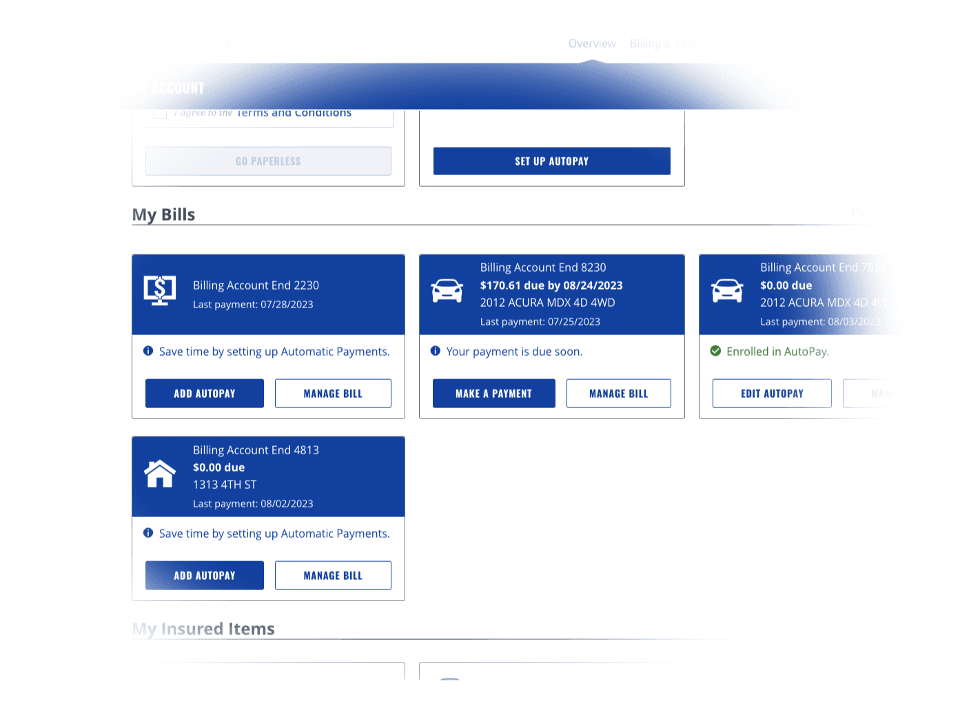
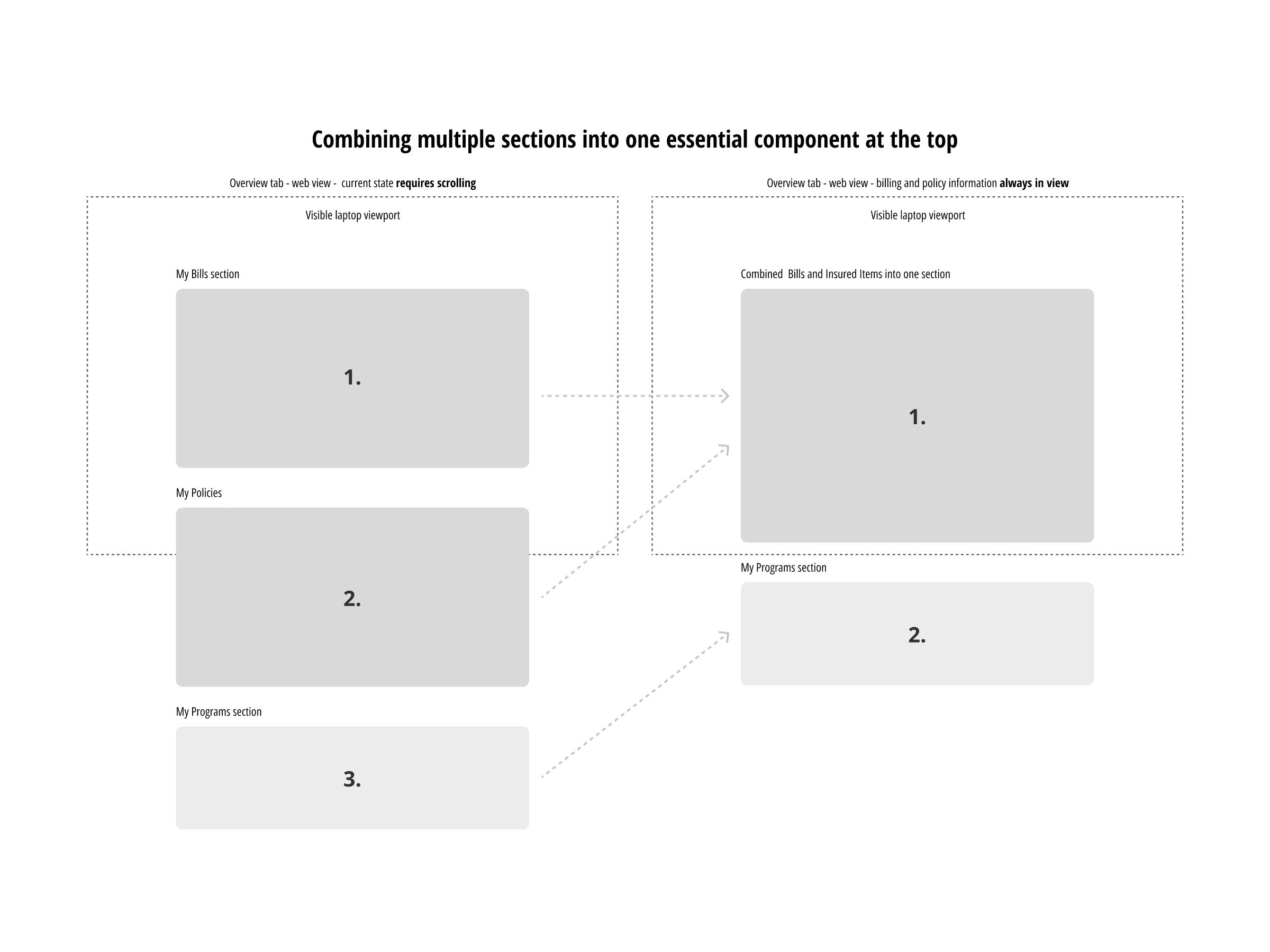
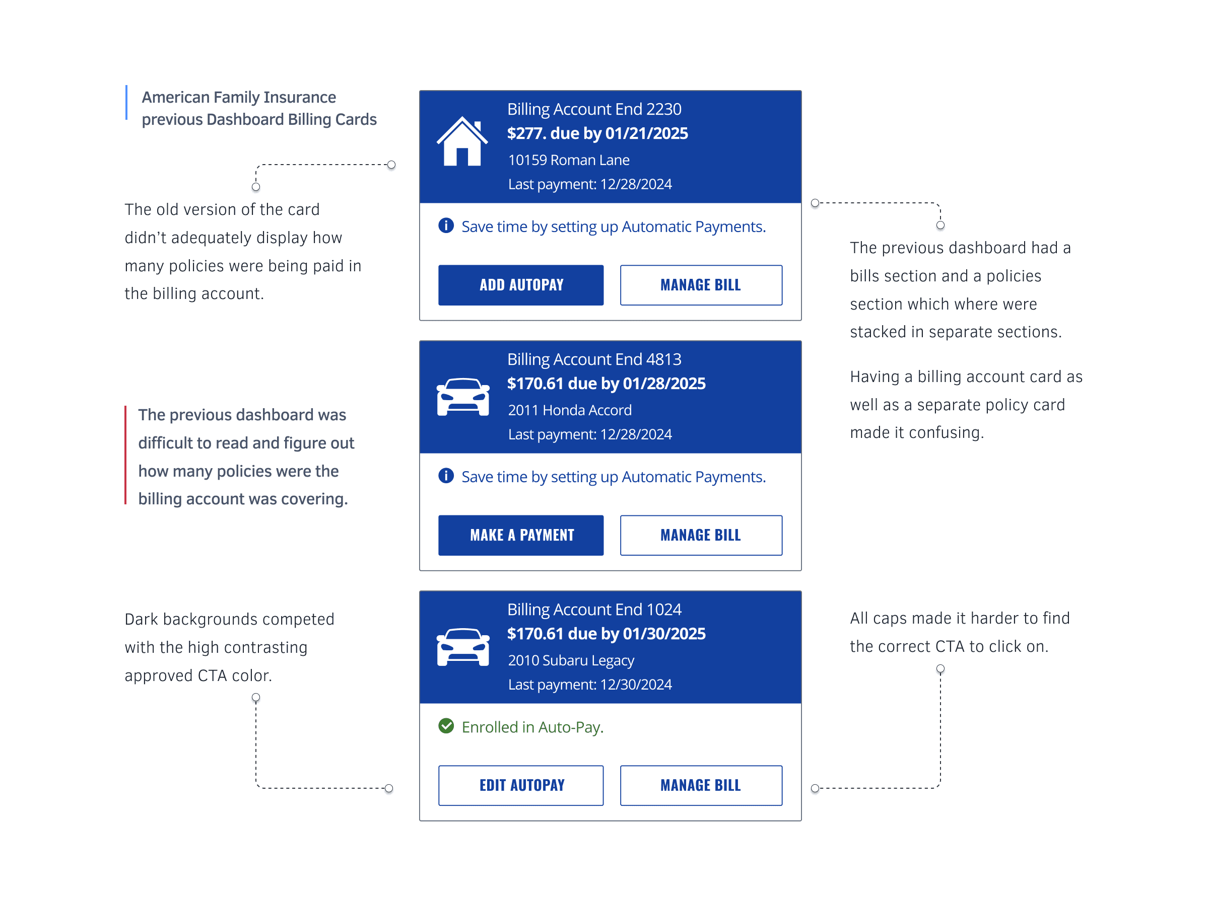
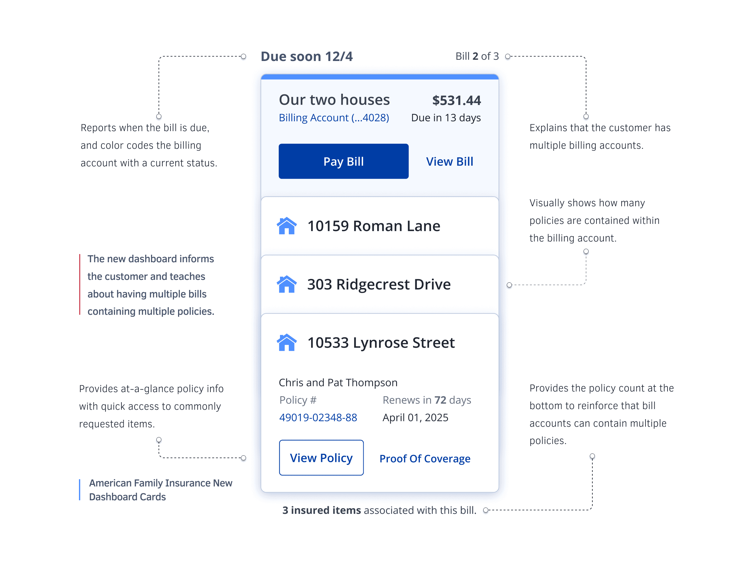
Research—via interviews with call-center reps, support call reviews, and internal UX findings—highlighted widespread confusion: users expected one bill per policy and had to mentally stitch together disconnected information. Often, policy cards were pushed below the fold and CTAs cluttered the page.


→ Complication

The disjointed layout forced users to scroll, guess, and call support. Multiple “Make a Payment” buttons with no hierarchy, no visual relationship between bills and policies, and weak visual cues—especially on mobile—left customers overwhelmed and frustrated.

Before: Logged-in billing cards and why they weren’t working.
After: The updated micro-dashboard and how it improved the experience.
Desktop View: Micro-dashboard cards move key info above the fold. Most AmFam customers manage 2.7 policies—this design makes that complexity easier to handle.

→ Change

You created a unified micro-dashboard card. Key info moved above the fold, CTA styles focused on actions only, statuses were color‑coded, and visual mapping showed which policies connected to which billing accounts. The card became glanceable, instructional, and actionable across web and mobile. It cut confusion, rebuilt trust, and reduced support calls by teaching users what they had, why it mattered, and what to do next … without digging.

Check this out

© Bryan Dorsey 2025

© Bryan Dorsey 2025

© Bryan Dorsey 2025